
Sunday, 21 December 2014
Thursday, 18 December 2014
Monday, 15 December 2014
Analysis of High School and Youth Drama
Task 1: ANALYSIS
Analyse title
sequences for both High School and Youth drama films, making notes on the
titles that we see in each, the order they come in, the category of title
sequence that they use, the font or type face they use and the type of content
we see behind them. Record your analysis in to the grid below and then post
it to your blog as evidence of your research.
Youth Drama eg 1
My Brother the Devil
|
Youth Drama eg2
Beautiful Thing
|
High School Drama eg 1
10 Things I hate about you
|
High School Drama eg 2
Mean Girls
|
|
What titles do
we see and in which order?
|
In
Order of what appeared on screen:
Production
Company
Main Cast
Executive Producer
Producers
Writer
Directors
Title
|
In
Order of what appeared on screen:
Production
Company
Main Cast
Title
Cast
Writer
Producer
Director
|
In
Order of what appeared on screen:
Production
Company
Title
Main Cast
Music
Director
Costume Designer
Co-Producer
Editor
Executive
Producers
Producer
Writer
Director
|
In
Order of what appeared on screen:
Production
Company
Main
Character
Title
Main Cast
Music
Supervisor
Music
Producer
Co-Producer
Costumer
Designer
Editor
Production
Design
Photography
Executive
Producer
Director
|
Category / type
of title
|
Moving
Images, Still Images
|
Moving
Images
|
Moving
Images
|
Moving
Image with title on
|
What font /
type face is used (describe this if you aren’t sure)
|
Font was
mainly plain and use of Capital Letters
|
The font
is Yellow to make it clear to the audience what is being shown and it is
mostly Bold.
|
Handwriting
is used in this and changes in different frames
|
Use of
different colours throughout. Also a use of Bold font to attract the audience
to read the information.
|
What action do
we see behind the titles?
|
Shows one
of the main characters walking home
|
it shows
the setting of the film; where it is set
|
There is a
conversation being held with a main character as they are introduced.
|
Shows the
backstory of the main character. Then as the film starts goes the scene in
the school.
|
Task 2:
Differences between the two sub-genres
Now write a
summary about the order and type of title sequences in High School drama films:
High School
Drama films will firstly show the production company with moving images. The
director will usually be shown last. These types of films will be of higher
budget so they will be able to show more titles in the credit as they have a
budget for it.
|
Now write a
summary about the order and type of title sequences in Youth drama films:
Youth Drama
films tend to show the production company first then goes onto show the main
cast of the production due to being less financed the title sequence budget
is lower therefore there is less credits.
|
Now summarise the
main differences in the title sequences of films from each sub-genre
The difference
between the two sub-genre films is that High school dramas will have a higher
budget therefore there will be a higher amount spent on these title sequences
which will mean the quality will be higher and more credit titles.
Differently Youth Drama films tend to be of lower budgets therefore having
less title credits in the sequence.
|
Come back to this handout when you are
planning the titles for your own teen title sequence after Christmas.
Sunday, 14 December 2014


Kidulthood Audience Research

After doing the audience research I had received shocking statistics that kidulthood, although a male based youth drama it was mainly viewed by the female gender. It was the expected the age range varied from 18-24 even though the certificate rating was 15.

Interestingly the audience group took part in recreational activities that had no reflection in the actual drama.


Research into Institution
Title Credits and Order Appearance
10 Things I Hate About You
- Production Company
- Title
- Cast
- Casting director
- Music director
- Executive music producer
- Associate producer
- Co-producer
- Editor
- Production designer
- Executive producer
- Producer
- Script writers
- Director
My Brother The Devil
- Film company
- Production company
- Cast
- Executive producer
- Producers
- Director
Mean Girls
- Paramount
- Paramount pictures
- Lindsey Lohan (main character)
- Title
- Cast
- Casting director
- Author of the book the film is based on
- Music supervisors
- Co-producer
- Costume designer
- Editor
- Production designer
- Director of photography
- Executive producer
- Producer
- Director
Beautiful Thing
- Channel 4 films
- Cast
- Title
- Writer
- Producer
- Director
Larger budget films, such as 10 Things I Hate About You and Mean Girls have more credits in their title sequences than lower budget films, such as My Brother The Devil and Beautiful Thing. The reason for this is that more major companies are able to afford the cost of crediting the members involved in the production.
Budgets
10 Things I Hate About You
Budget: $16million
Opening weekend: £439,976 (UK, July 4th 1999)/ $8,330,631(US, April 4th 1999)
Box office: $53million USD
My Brother The Devil
Budget: £690,000
Opening weekend: $10,305 (US, March 24th 2013)
Box office: £1.2million
Mean Girls
Budget: $17million
Opening weekend: £1,393,494 (UK, June 20th 2004)/ $24,432,145(US, May 2nd 2004)
Box office: $129million USD
Beautiful Thing
Budget: within the region of £400,000- £500,000
Opening weekend: $33,931 (US, October 11th 1996)
Box office: £3million
Main Stream
Mean Girls
10 Things I Hate About You
Independent
My Brother The Devil
Beautiful Thing
In a Mainstream production title sequence I would expect to see more credits as they tend to have a higher budget for the production as it can be seen that Mean girls had a budget of $17 million. Differently an independent film will have a lower budget so therefor the title sequence will have less of a budget so less institutional information will be broadcasted.
Thursday, 11 December 2014
Research - Teen Dramas - Title Sequence - research into industry
Teen Drama- Title Sequence
Title sequence of '10 Thing I Hate About You' included:
Larger budget films, such as 10 Things I Hate About You and Mean Girls have more credits in their title sequences than lower budget films, such as My Brother The Devil and Beautiful Thing. This is due to the fact that more people are contracted in larger budget films, however lower budget film usually have more production companies within the title sequence.
The order in which they are presented change also in terms on the budget allowed for example:
Title sequence of '10 Thing I Hate About You' included:
- Production company
- Title
- Cast
- Casting director
- Music director
- Executive music producer
- Associate producer
- Co-producer
- Editor
- Production designer
- Executive producer
- Producer
- Script writers
- Director
Title sequence of 'Mean Girls' included:
- Paramount
- Paramount pictures
- Lindsey Lohan (main character)
- Title
- Cast
- Casting director
- Author of the book the film is based on
- Music supervisors
- Co-producer
- Costume designer
- Editor
- Production designer
- Director of photography
- Executive producer
- Producer
- Director
Whereas title sequence of 'My Brother The Devil' included:
- Film company
- Production company
- Cast
- Executive producer
- Producers
- Director
Title sequence of 'Beautiful Thing' included:
- Channel 4 films
- Cast
- Title
- Writer
- Producer
- Director
These are all teen movies but request different things within their title sequences. The difference between mainstream and independent movies have a large gap in terms of budget provided meaning the credits shown are also affected as larger budget films important figures have more of a demand to be within the opening sequence. However the up side is that larger budgets me higher box office revenue.
Budget of '10 Things About You:
- Budget: $16millionUSD
- Opening weekend: £439,976 (UK, July 4th 1999)/ $8,330,631(US, April 4th 1999)
- Box office: $53million USD
Budget of 'Mean Girls':
- Budget: $17million
- Opening weekend: £1,393,494 (UK, June 20th 2004)/ $24,432,145(US, May 2nd 2004)
- Box office: $129million USD
In comparison to the budget of 'My Brother The Devil':
- Budget: £690,000
- Opening weekend: $10,305 (US, March 24th 2013)
- Box office: £1.2million
And also the budget of 'Beautiful Thing':
- Budget: unknown ( although not seen we can assume it wasnt more the £500,000)
- Opening weekend: $33,931 (US, October 11th 1996)
- Box office: £3million
Audience Research - American Pie
Audience Viewing
when doing our audience research, the result in which we obtained was highly unexpected for example:


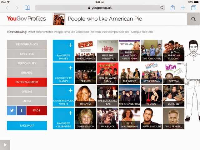

when doing our audience research, the result in which we obtained was highly unexpected for example:
in this screen grabbed we see that the majority of people who viewed this film the most were from Wales as you would expect in to be many from central England
Another example of unexpected results:
is the idea that many people who viewed this film were cat lovers and also fans of quizzes and sleeping yet they love boxing highly peculiar.
Lastly this slide shows the amount of people who go online and how long they stay there for:
This is a believable as the film portrays a lazy setting of party crazed teens
Different Types of Title Sequences


There are 4 main categories of title sequences
Titles on a blank screen
- White typeface on a black background to create high contrast.
- Studios used this style of title sequence because it was very low budget and uncomplicated way to include institutional information.
Example 'Psycho'
- is very easy to understand
- easily readable allowing all information to be seen with just small background music to go along with it
Titles on still images
- includes hand drawn borders and other images
- used to hint at the films tone or genre
- allows the credits to be longer and more detailed
- and abled to include more than just the studio - combining two different media's
Example 'Wimbledon'
- very simple
- gives the viewer an understanding of the event that is on show
- shows us what the programmes about before it has started
Titles on moving images
- Incorporates moving images with credits to offer either - A metaphor or - A narrative thread
- Telling us more about the film before it has started
Example Alfred Hitchcock's - 'Rear View'
- it sets the place along with giving us information about the studio, producers and cast.
- we get an idea about the time the movie is set in.
Titles using animation or motion
- 1990s' animated text became popular
- titles became apart of the moving images and were intergrated together
- required lots of digital technology and styled editing
Example 'Casino Royale'
- give the viewer more of an oppurtunity to to get a feel for the film while incorporating a fun type of animation, however still being able to have real action but unrealistic features
- this allows the director to be more imaginative and abled to branch out.
Research - Art of the Title
Game of thrones Vs 21 Jump Street
Game of thrones
- The credits in this TV programme show all the main actors within the opening sequence with no specific order shown.
- This it then goes on to show the executive members of the production team towards the end and lastly shows the writer and the director. So the order of importance ends with the director who is arguably the most important member of the whole production.
- To make 'Game of Thrones' stand out they had Charlie Samways create them a font called 'Game of Thrones'.
-The font is alternated from left to right and through the middle, vanishing then reappearing with different names and important figures.
- We are also introduced to the territory's within the programme and the different kingdoms and empires.
- The music sounds medieval and pre historical to assist the background effects of the building up of the kingdoms.
I like how in the background of the opening credits they show us the construction of the empires and shows us how they end up, this creates a bridge between us in the present and their civilisation in the past, making the viewer join the atmosphere of the TV programme.
http://www.artofthetitle.com/title/game-of-thrones/
21 Jump Street
- The movies opening sequence begins with 'The End' this is supposed to be funny as it is actually the start creating irony.
- This movie going in opposite to the other as it starts with the most important first starting with the director and executive producers and directors, so on and so forth.
- Then we are also shown the actors in accordance of importance and role.
- The font used is a plain blocked capital font with the names in the middle of the screen and moving in opposite directions from left to right or vice versa.
- We are introduced to the main characters and are giving small information that they are police officers.
- We are also given the overall context of the film as we see drugs, money, guns and bullets giving us the overall drift of the film.
- the music supports the background as its all about young party music.
What I like about this opening sequence is that it subliminally shows the audience all the the things that are intended to happen throughout the movie but just scattered throughout the whole title squence.
http://www.artofthetitle.com/title/21-jump-street/
The opening sequences are different in their own right however they both aim to grab the viewer and prepare the mood for the production they are about to see for 'Games of Thrones' it's to take the audience back into the past, but for '21 Jump Street' it's to start a comedic feeling as nothing is clear but yet it is still going to make you laugh it also creates a action police vibe as well.
What is a Title Sequence?

What is the purpose of the title sequence:
- The title sequence is supposed to show the audience important figures within the movie while also setting the emotion and atmosphere.
- The title sequence is also supposed to use music and scenery to create the mood for the whole movie whether it be a comedy or action or even horror.
- Lastly the title sequence is supposed to present the film before the film has started, this is by creating a feeling, setting a place and interacting with the audience. Making the audience feel as if they are in the film itself.

Analysis of Title Sequence

Captain America: Winter Soldier(2014)

- The screening instantly shows the credits naming the producers and director involved in the film
- Heroic music is played in the background instantly which builds suspense and attracts the attention of the audience
- Throughout the title sequence it shows several actions of Captain America doing combat with the shield, which foreshadows what may happen in the film
- There are several logos which appears on the screen as the title sequence takes place which is associated with the actual film
- The font throughout stays consistent and is bold and broad.
- After the producers and directors are introduced it then goes onto the main cast
- It shows bold shadows of the characters besides the names as they appear on the screen.
21 Jump Street(2012)

- The film opens with a 5 second long clip showing what the movie is based on, it shows who the main target audience for the film is with
- Shows the credits naming the producers and director involved in the film
- Throughout the film it shows clips of what happens in the film
- The cast is shown however it is mixed in with the listing of people involved with the making of the film
- The background music is used to create an uplifting mood signifying that the film is intended to be exciting and fast paced
- In the background audio clips from the actual film is used.
- The font is Bold italics and stays consistent throughout.
- The font colours are coherent to the background being displayed
I picked this sequence as this film is targeted at audiences my age and the representation is shown in a humorous way.

Subscribe to:
Comments (Atom)